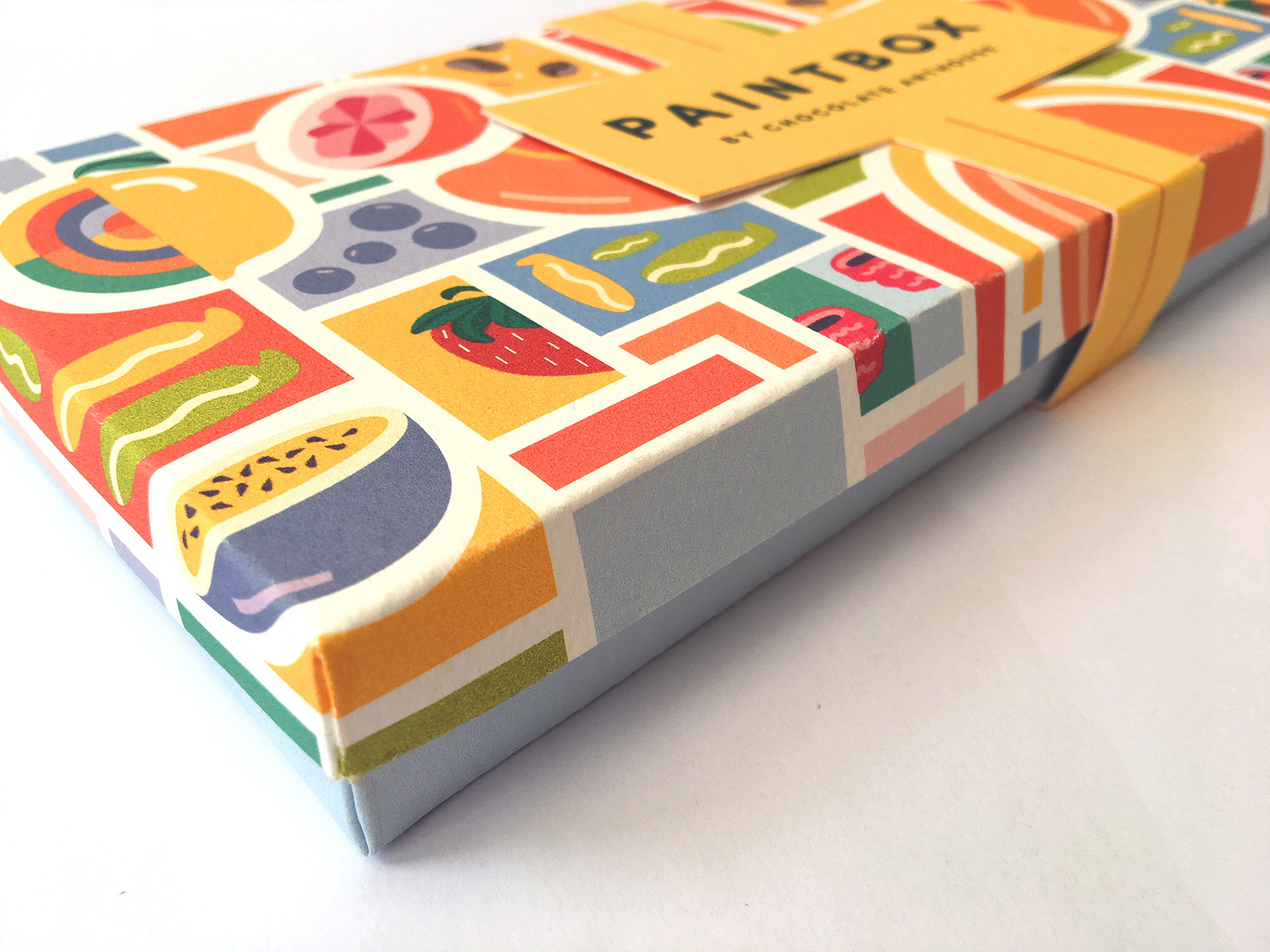
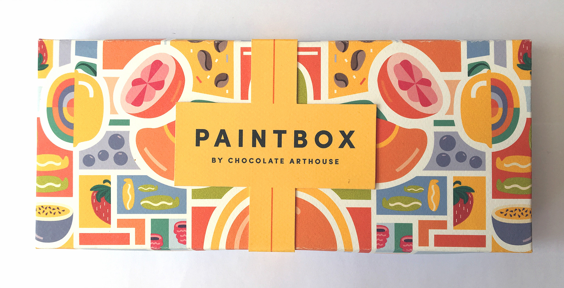
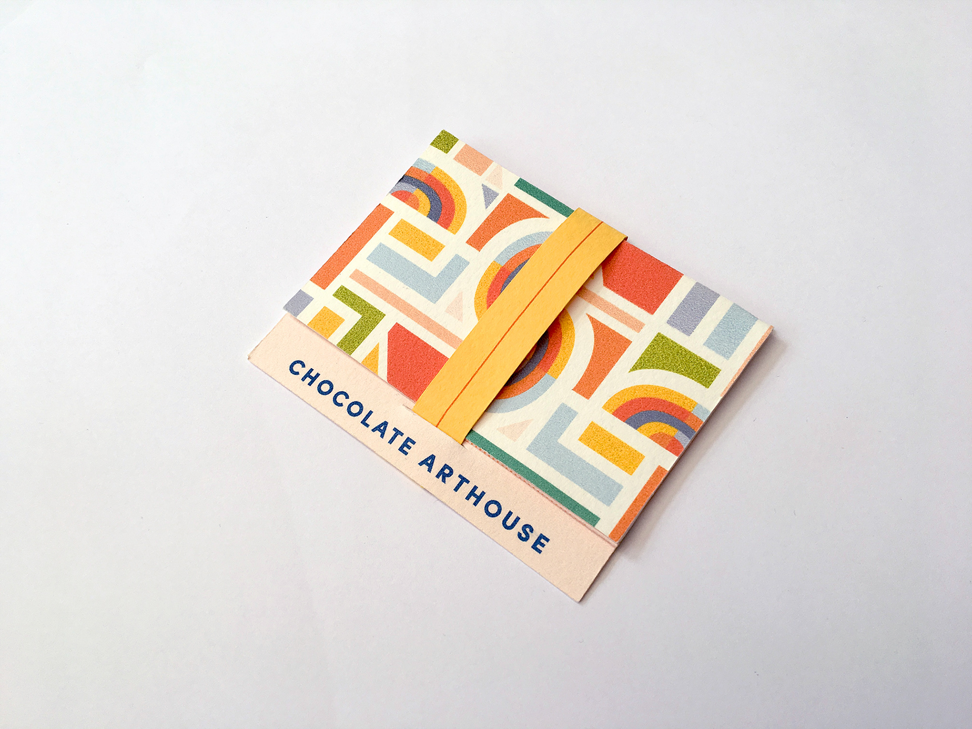
Chocolate Arthouse is a company that specialises in creating beautiful hand-made chocolates with a unique, artistic flair. Inspired by Modernist art and incorporating fresh, local ingredients – the Paintbox is a riot of colour and flavours. Reflecting these aspects and pulling them into the design led to the use of a bright, bold colour palette and geometric shapes.
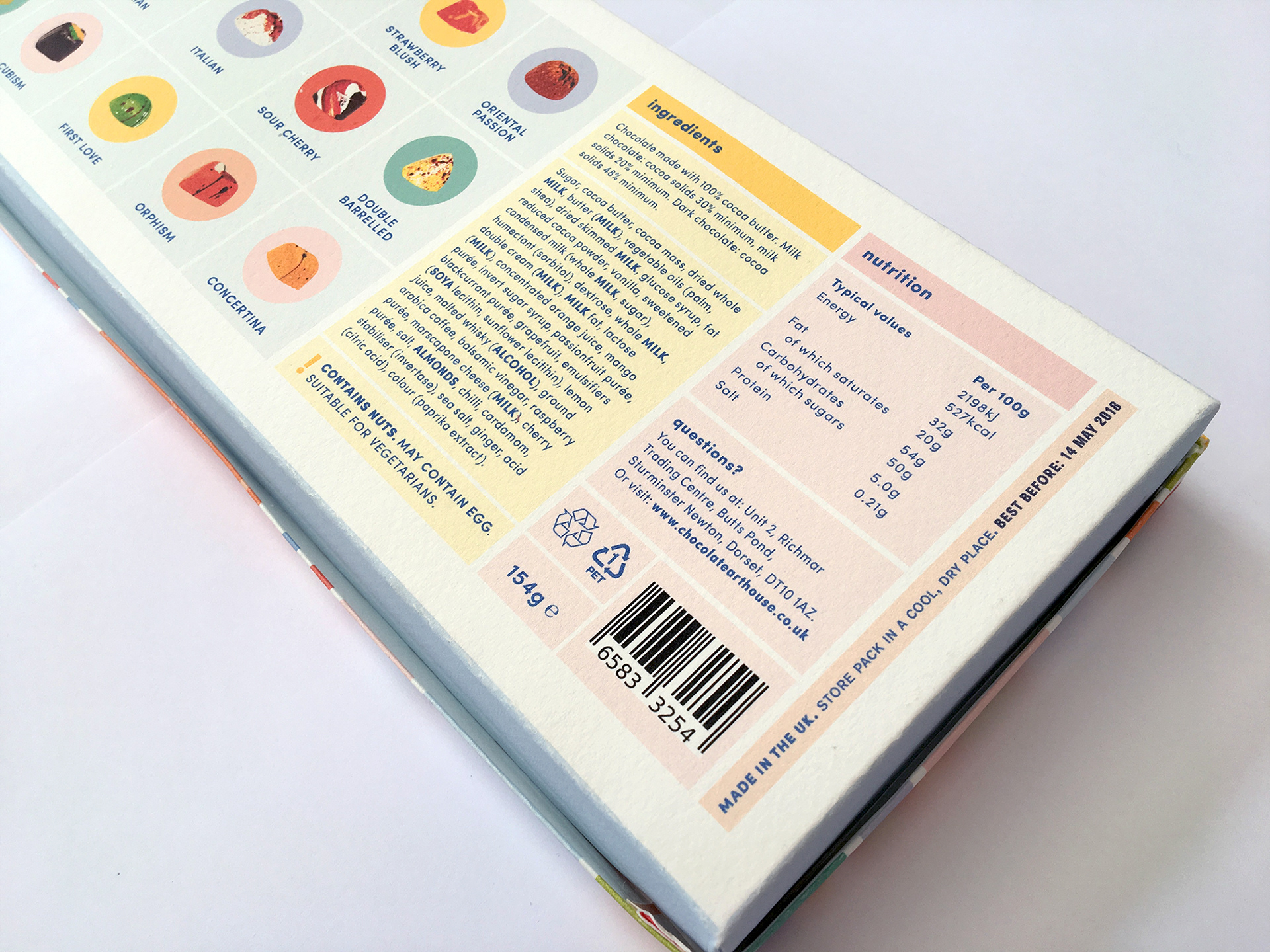
For the box itself, a pattern was made using the ingredients found in the chocolates as an inspiration. With so many exotic tastes inside, it seemed a shame not to advertise it on the outside! Printed on a textured stock, reminiscent of watercolour paper, the box feels sturdy and interesting when held.
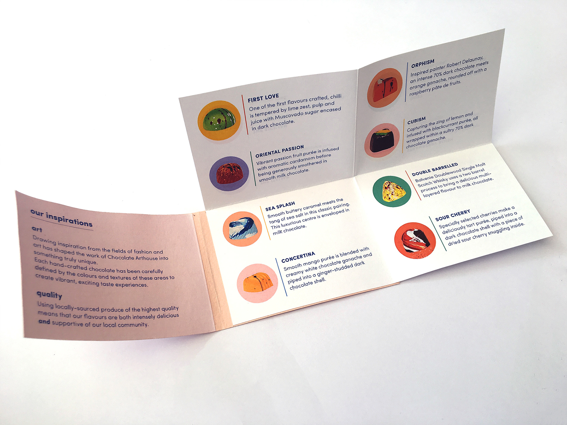
With twelve individual flavours to fit into the booklet, I decided to use some folding to make the most out of the small space. Happily, this necessary function also makes for a more interesting leaflet for the customer to interact with.

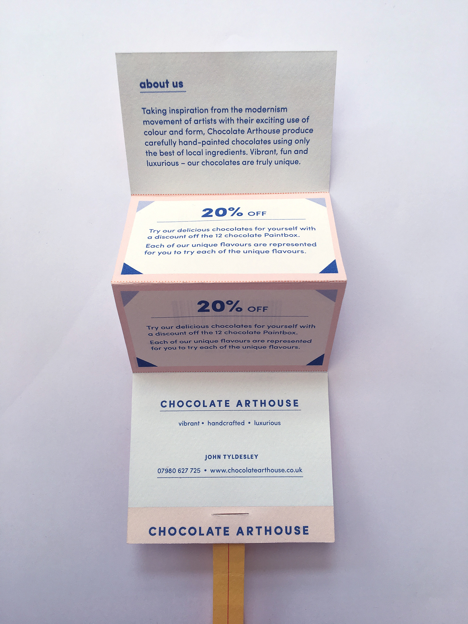
With Chocolate Arthouse doing a lot of trade shows and local events, I thought it would be best to incorporate a business card alongside a promotional offer and a small introduction to the company all in one place. Each section is perforated so that the coupons and business card can be easily detached and kept. The textured stock is the same as that used on the box so as to link the two together, as well as create a feeling of quality.